What does a logo and a name reveal about how mature a brand strategy really is?
Introduction
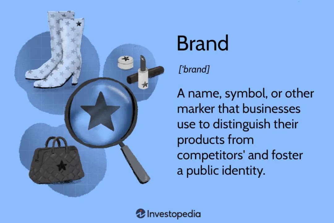
The industry has grown fast and brands have sprung up everywhere, each with its own commercial strategy — some carrying a brand across borders and economic cycles, some opening the market fast on margin and channel.
Every company’s brand equity sits at a different depth. And brand building — the transmission of what a company stands for — usually starts with a name and a logo.
Look at the Chinese names of these much-discussed products. What is your first impression?
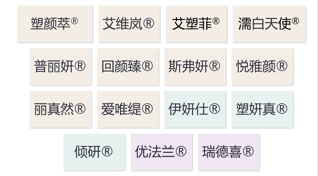
I had wanted to make this chart look better, and while trying to gather the product logos I ran into something interesting. Some have a complete naming and visual system; some have no logo at all. Some carry over the overseas market’s logo with no local adaptation; some companies have no coherent naming across several brands they own; others simply mix corporate and product logos together. What all of that reflects is how differently companies understand the word “brand”.
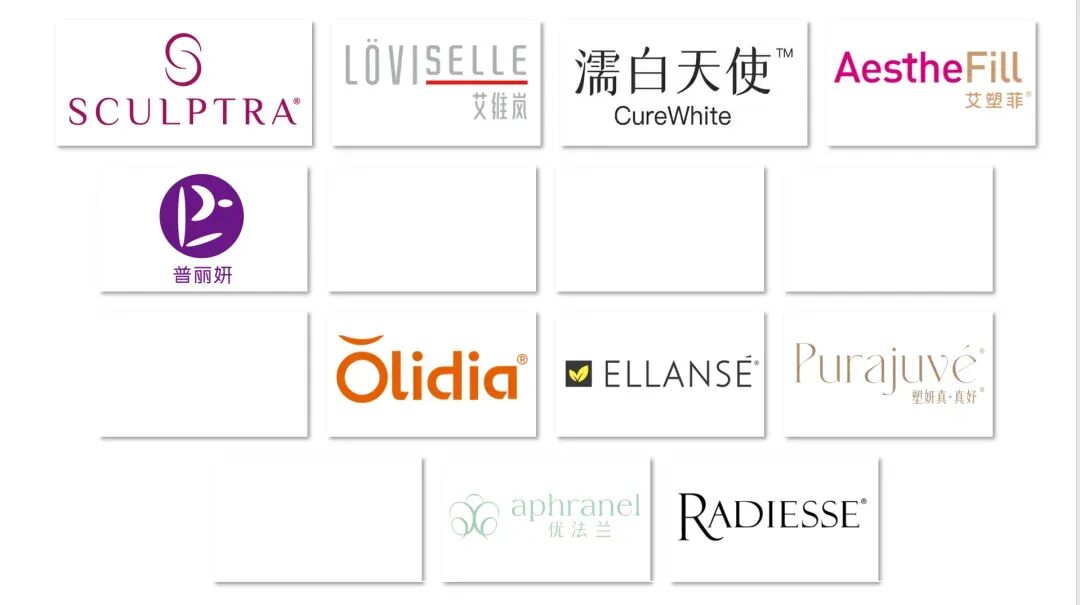
PS: everything here was gathered from publicly available online sources. Some brands are not yet in commercial promotion and material is limited, so this is illustrative only.
If a brand is the operating system for how people perceive you, the name and the logo are its welcome screen. How professional, how consistent and how strategic they are determines whether the company leaves any real impression on physicians and consumers.
Today let us talk about naming, logos, brand boundaries and the common confusion of identities — using classic cases from fashion and consumer goods to offer some thinking for brand building in medical aesthetics.
Naming
The origin point of memory, or a selection of trending characters?
In marketing theory, a brand name is not merely a label; it is the first step in positioning. A good name should be easy to say and easy to recognise, and it should convey the product’s core value and perceptible difference.
In practice, though, a great many medical-aesthetics product names remain at the level of “pick the fashionable characters” — or at the stage of “the owner’s wife likes it” and “the feng shui is good”.
Take one company: there is no systematic relationship, no semantic pattern and no phonetic consistency across the names in its regenerative range. Naming each product in isolation is convenient for registration, but strategically it weakens the brand’s extensibility and its power of association. Which is why, however lively the launch, the market’s natural shorthand ends up being “that company’s PLLA” or “that company’s skin booster”.
Look at classic naming strategy in consumer goods. Procter & Gamble’s haircare portfolio — Pantene, Head & Shoulders, Rejoice, Sassoon — uses different names, but every one of them was built on a clear functional claim and a defined audience.
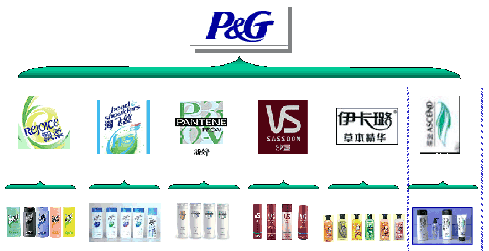
Rejoice is about smoothness; Pantene about health; Head & Shoulders about dandruff; Sassoon is the haircare expert; Clairol is about colour care.
- Rejoice — that is what confidence feels like
- Head & Shoulders — no more flakes, better hair
- Pantene — with Pro-Vitamin B5, for healthier, shinier hair
- Sassoon — the international haircare master
- Clairol — back to nature, made with care for it
P&G holds over 30% of the global haircare market and has long been called the West Point of marketing. Traffic-driven media has disrupted it, and plenty of small, excellent brands each have their strengths — but it is still worth learning from.
The underlying logic of brand naming should satisfy three conditions:
- Consistency: keep the naming register coherent across the portfolio so people can see what belongs together.
- Imagery: convey the proposition, the sense of the material, the sense of technology, and a cultural and aesthetic feel.
- Extensibility: leave room for the future product lines and the brand architecture they will need.
With products this undifferentiated, the name is the origin point for claiming a place in people’s minds. Chaotic naming fragments brand memory, sharply reduces the efficiency of communication, and discounts long-term value. Anyone familiar with business management knows how directly goodwill shows up in the accounts.
Logo and visual identity
A brand’s first impression is strategy made visible.
Once you have a good name, it has to be turned into something visual. A logo is not just a graphic mark; it is a condensation of the brand’s idea, its emotional register and its whole visual system. Visual identity is brand strategy made external.
On the internet — where most brand communication happens — you can easily see that some brands have a complete VI system, combining elements such as a wordmark, symbol, slogan and visual container, together with a colour system, typographic rules and various layout and application guidelines. (I am using my own channel as the example to avoid any copyright question.)
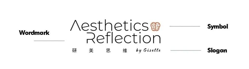
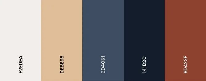
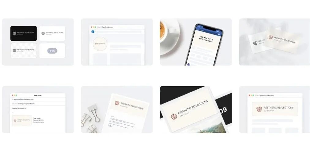
Layout guidelines
Some brands launch loudly and yet all you can find online is an interview with an executive and a portrait of the management team. There is no product brand identity extended through the communication at all — just the registered Chinese name standing in for it, wasting an enormous amount of media investment.
Having no VI system is invisible waste and lost effect:
- Higher communication costs: with no fixed, consistent rules, every piece of communication has to re-explain what the product is.
- No visual anchor: the market never forms a stable visual association, and there is no memory hook.
- Extension is difficult: with no VI foundation, consistency across media — online and offline, packaging, decks, press assets — is hard to maintain.
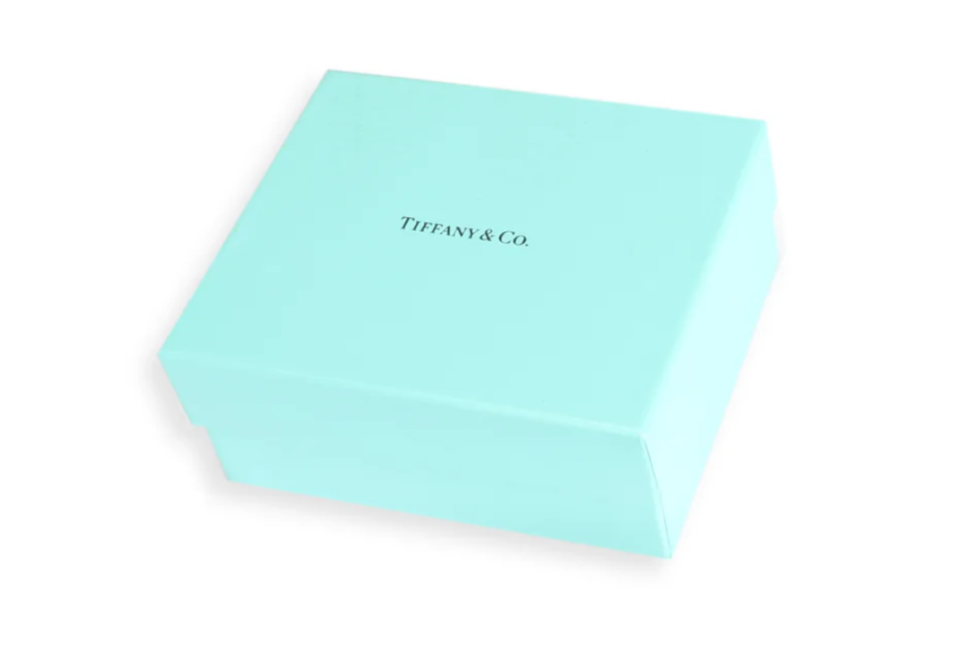
Applying a VI is not rigid; it is flexible and varied. Consider a classic case: the Tiffany blue box. It is not a registered graphic logo, and yet it is a brand symbol that needs no explanation anywhere in the world. The power of the visual comes not from the design itself but from consistent, stable output compounded by time. Plenty of medical-aesthetics products like borrowing a luxury house’s colour, which is a clever shortcut in itself — but it still has to start from the product’s own positioning and build a durable, consistent system of its own, rather than stopping at a primary colour.
More importantly, VI design is not a job for a graphic designer. It is part of brand strategy, and it requires management to interpret and translate the company’s own brand culture and the product’s character in depth.
Confused brand hierarchies
Company name? Product name? Business unit name? Let us settle it
One common phenomenon in day-to-day medical-aesthetics marketing is the shared-logo pile-up, including but not limited to:
corporate brand + medical-aesthetics business unit brand + product brand
, and occasionally a partner platform or partner company name on top (a clinic group, say, or a distributor). Three or four logos on a single poster is visually dense and confusing, blurs the message, and ultimately damages recognition of and trust in the core brand.
In brand architecture terms, there are three approaches available:
Branded house (single-brand strategy)
Apple, for instance, puts every product — iPhone, MacBook, iPad — under the master brand, reinforcing Apple itself. Common where the target audience is consistent and brand value needs a single expression.
Dior is another. Fashion, cosmetics and fragrance are different lines, but all of them carry Dior’s luxury identity. At a recent in-person event for brand ambassador Deng Wei — for the fashion line — the cosmetics counters in the same mall sold out online and off within seconds, setting a record over 600% above the historical high.
House of brands (multi-brand strategy)
Beyond P&G’s haircare, consider L’Oréal Group, with entirely independent skincare subsidiaries. Their VI systems have no shared connection and each focuses clearly on a different audience. At the same time, they are grouped into business units by adjacent markets to capture channel and marketing synergies:
🔹 CPD (Consumer Products): L’Oréal Paris, Maybelline, Magic and others.
🔹 LD (L’Oréal Luxe): Lancôme, Helena Rubinstein, Armani, YSL, Yue Sai, Kiehl’s, Shu Uemura, Biotherm.
🔹 CDB, formerly ACD (Active Cosmetics): SkinCeuticals, La Roche-Posay, Vichy.
🔹 PPD (Professional Products): Kérastase, L’Oréal Professionnel salons.
None of these unit names carries its own VI stacked into external communication. They are used internally, for function.
Hybrid architecture
Nestlé, for example, uses the Nestlé master brand for coffee, formula and other core categories, while also running independent brands such as Nespresso, Purina and Gerber.
The Estée Lauder Companies are another archetype: Estée Lauder itself projects a strong prestige-skincare identity, alongside independent subsidiaries such as Lab Series, Clinique and La Mer.
Colgate-Palmolive runs an oral-care range under the Colgate master brand while also having acquired brands such as Hill’s in pet nutrition — a hybrid of multi-brand and partial master-brand synergy.
This model suits companies with a wide span of product lines and diverse market demands, needing to balance group influence against individual brand character. The master brand usually carries the corporate value proposition while the other product brands reach beyond the company’s core business.
Recommendations for brand use in medical aesthetics:
- Early on, lead with a master brand to build memorability; later, extend into functional line brands to build category management capability.
- In consumer-facing contexts, lead with the product brand and use the company as endorsement.
- For distributor recruitment, investment and commercial conversations, emphasise the corporate logo to build confidence.
- Companies running a hero-product strategy should foreground the product brand.
- Where an event or partnership means two brands appear together, define which logo is primary and how they are arranged. Avoid logo pile-ups.
Use a different logo at different events, or mix primary marks, and the end result is diluted brand equity and much less efficient communication.
Recommendations on brand strategy
How do you build a system with visual unity and functional difference?
Return to what a brand is fundamentally for: building trust. Logo and name are surface expressions; underneath sits the construction of brand equity as a system — occupying a place in people’s minds, expressing a benefit, supporting it with argument, and delivering it in the product.
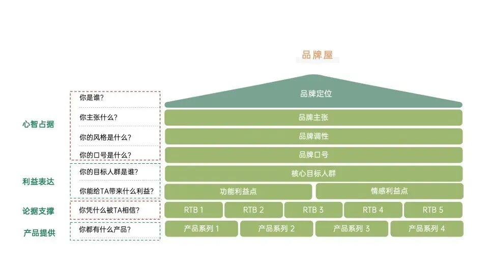
For most companies in this industry the theory may be dry and the elaborate outputs unnecessary, but the basic brand assets still need to exist. Three strategic recommendations:
Think in terms of a master brand plus a product family
- For example, establish “Suyan®” as the master brand with “Suyan Cui” and “Suyan Zhen” beneath it, to build coherence. (These are invented examples — but that character combination reads exactly like a real product family, which is how effortless it can be.)
- Naming comparable products as a series, with a unified visual, compounds brand equity.
Build a brand asset management system
- Brand guidelines, positioning strategy, an explanation of the naming logic, rules for how the brand appears, and so on.
- Define the boundaries within which different departments and partners may use brand elements.
Manage the brand’s visual identity as a design system
- Adopt the design-system idea: a unified set of typefaces, colours, layouts and templates.
- Don’t agonise over whether it is beautiful. Have one first; it can be upgraded later. What matters is that the visual style stays consistent. Better still, test it with clinics and the market rather than having the owner sign off on personal taste. (Not that owners have bad taste — but most of them are not the ones paying for medical-aesthetic treatments themselves. Strong survival instinct here.)
In closing
From the visual to perception, from perception to an asset
A brand is not designed into existence. It is managed into existence.
A brand’s name and logo may only be the initial settings, but they determine whether people will go on trusting you, repurchasing and recommending. This industry will certainly move from channel-led to brand-led, and from sales-driven to trust-driven. The earlier you build an awareness of brand equity, the better positioned you are in the competition to come. The brand equity of the leaders is not out of reach, and small brands have every chance to stand out.
A logo does not exist to be beautiful. It exists so that years from now it is still the doorway to memory in the market’s mind and the consumer’s.
Finally, a strong recommendation to friends at clinics and distributors: when you are choosing which product to work with and the products are broadly comparable, look at how much brand equity there actually is, and look at whether the brand knows clearly who it is telling its story to.